-
TABLE OF CONTENTS

Shopify Just Dropped 10 Free Themes—and They’re Built to Convert
If you’ve been holding off on picking a free Shopify theme, now’s the time to reconsider.
Shopify just launched 10 new free themes under its Horizon Collection—and they’re nothing like the outdated starter templates you’ve seen before.
These new Shopify templates (free and official) aren’t just pretty skins. They’re designed for performance, mobile-first UX, and faster store launches—all while keeping your costs at zero.
Whether you’re launching a fashion brand, selling supplements, or scaling a pet product store, there’s now a theme that doesn’t just look good but helps you sell.
In this guide, you’ll find:
- A breakdown of all 10 new free Shopify themes
- What makes each one unique (and who should use it)
- How to pick the right theme based on catalogue size and industry
- Why these new Shopify website templates are a serious upgrade from older freebies
If you’re a founder, designer, or ecommerce marketer looking for speed, structure, and style—without the price tag—this is for you.
Let’s explore!
Why Free Shopify Themes Are Better Than Ever in 2025
Before the latest collection, free Shopify themes used to feel like a compromise.
Sure, they worked. But they weren’t exactly… exciting. Clunky designs, limited flexibility, and nothing that really made your brand stand out.
Fast forward to 2025, and Shopify’s Horizon Collection changes the game completely.
Here’s why these Shopify website templates are worth using this time around:
1. Built with Shopify 2.0 from the Ground Up
All 10 themes are built on Online Store 2.0, so you’re getting access to sections on every page, flexible app blocks, and drag-and-drop layouts that used to be premium-only.
2. Optimized for Mobile
Mobile traffic dominates ecommerce—no surprise there. What’s different now is how well these free themes perform on mobile.
We’re talking about:
- Faster load times
- Buttons and links that are easy to tap
- Checkout flows that don’t make you rage-quit
You won’t need a developer to fix things later.
3. Designed Around Specific Niches
Unlike older themes that tried to be everything to everyone, Horizon themes lean into purpose.
Take Savor, for example—it’s built to showcase rich visuals, perfect for food, drinks, or anything edible.
Pitch was clearly made for focused brands with one standout product—it reads more like a landing page than a storefront.
And Ritual? It’s calm, clean, and designed to build trust—great for wellness, skincare, or supplements.
They’re not just free—they’re built with real brand types in mind.
4. Better UX Out of the Box
The new lineup borrows from modern UX best practices:
- Built-in filters and smart menus
- Clean, readable fonts
- Predictable layouts that guide the eye
- Accessible colour schemes (because not every shopper sees the web the same way)
Most stores would pay to get this level of polish—and here, it comes baked in.
5. Backed by Shopify, Not a Random Developer
One of the biggest pain points with third-party free themes? Support (or the lack of it).
These are official Shopify templates.
They get updates.
They stay compatible with future platform upgrades.
You’re not left crossing your fingers when Shopify rolls out a new feature.
Free, but Far From Basic
This time, free doesn’t mean “basic.”
It means fast setup, real design options, and room to grow—without touching a line of code or paying upfront.
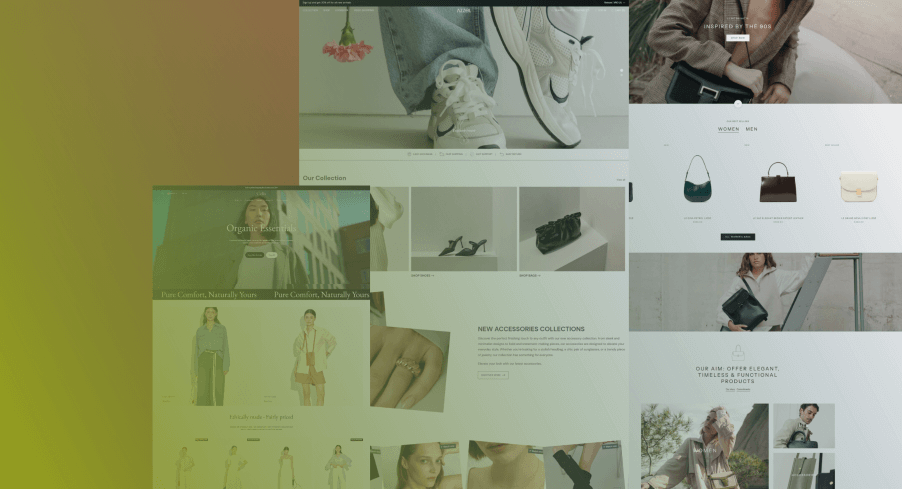
Quick Overview: All 10 Free Shopify Themes (Horizon Collection)
Shopify dropped ten new free themes this year—and, honestly, they’re better than you’d expect.
Here’s a simple breakdown of all 10 and where they shine.
What Each Theme Is Good At
| Theme Name | Great For… | Best If You Have… | What Stands Out |
| Fabric | Apparel, lifestyle | Medium to large catalogue | Editorial layouts, modern grid, feels like a lookbook |
| Savor | Food, drink, edibles | Small to medium catalogue | Big imagery, bold fonts, homepage built to tell stories |
| Horizon | General purpose | Medium catalog | Clean design, flexible structure, nothing feels locked in |
| Heritage | Handmade, heritage products | Small, niche catalogue | Classic fonts, timeless feel, a little boutique-y |
| Ritual | Skincare, wellness, supplements | Medium catalog | Calming layout, trust-focused, soft visuals |
| Tinker | Kids, toys, creative brands | Small catalog | Bright, playful layout—feels like fun |
| Pitch | Startups, product launches | Single or a few SKUs | Bold hero, clear CTA—reads like a landing page |
| Dwell | Home goods, interiors | Medium catalog | Minimalist with room to breathe—great for visual brands |
| Vessel | Ceramics, art, boutique shops | Small product count | Clean and gallery-like—lets photos do the talking |
| Atelier | Creators, portfolios | Small catalogue or no store | Bio blocks, soft structure—more about you than your SKU |
Theme Picking Cheat Sheet
- Running a fashion or home brand? → Fabric or Dwell are strong picks.
- Need trust and clean layouts for skincare or supplements? → Ritual feels built for that.
- Selling one signature product? → Pitch is direct, no distractions.
- Just want something beautiful and simple? → Atelier or Vessel will do the job.
All of these are Shopify templates—free, official, and ready to launch. No weird plugin dependencies. No theme developer disappearing next year. Just well-structured designs that work out of the box.
Theme-by-Theme Breakdown (What Each One Feels Like to Use)
Here’s the part you’re probably looking for—real talk on how each theme performs.
We tested them, clicked through, and looked at the details that matter when you’re building a store:
- Layout flow
- Mobile usability
- Customization flexibility
- And whether it feels “boxed in.”
Let’s review these themes in detail.
1. Fabric – Fashion & Lifestyle Brands Oriented
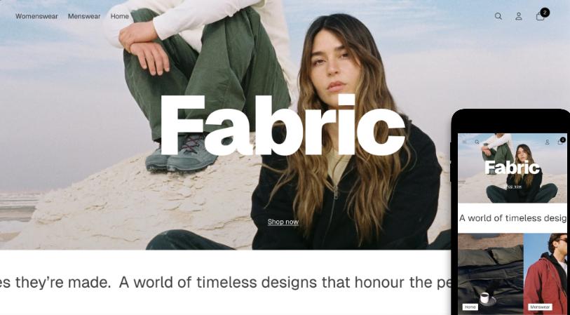
It has a clean, editorial look you usually have to pay for.
- What stands out? The homepage feels like a magazine spread. Big images, great typography, and just enough breathing room between sections.
- Good fit for: Medium to larger catalogues—brands with more than just a few SKUs
- Features worth noting
- Easy and Fast setup.
- Built for visuals – The layout gives your product photos room to breathe. Great if your brand leans heavily on imagery and style.
- Helpful selling tools baked in – Stuff like sticky cart, quick buy, and countdown timers are included—nice touch for nudging conversions.
- Strong on product details – Video support, colour swatches, and zoom give customers what they need without leaving the page.
- Browsing feels smooth – Features like infinite scroll and swatch filters make product discovery less of a chore, especially on mobile.
- Extras you’d usually pay for – Things like stock counters, cross-sells, and “recently viewed” are just there—no app installs or workarounds.
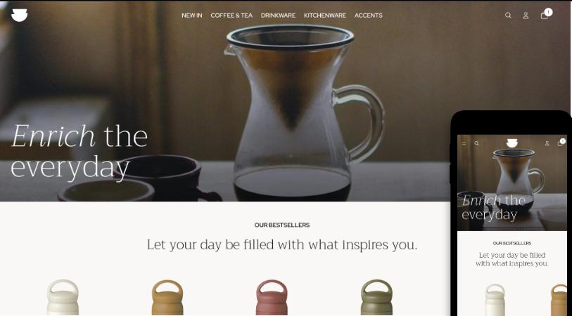
2. Savor – Made For Food & Beverage Brands

Savor is a clean, photo-friendly theme that helps your food or drink products look their best. If your brand shines through your packaging or ingredients, this theme brings it to life.
- Why is it different? It feels a bit like a food blog and a shop mixed together—easy to use, but not boring or overdone.
- Great for: Smaller product ranges where looks and story matter.
- What you get:
- Light and straightforward setup
- Photo-first layout – Big pictures. Simple design. No mess. Your products are the focus.
- Easy Shopping Tools – Quick-buy buttons, a cart that sticks to the page, and pre-order options make checkout fast.
- Built-in trust features – Show off press mentions, add promo banners, and use tools like stock counters and product suggestions.
- Better Product Display – Add zoom, colour swatches, videos, or photo galleries to show your products from every angle.
- Helps customers find things fast – Includes filters, drop-down menus, sticky headers, and endless scroll.
3. Horizon – For Versatile, General-Purpose Stores
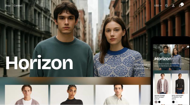
Horizon is a flexible, free Shopify theme. It’s versatile, clean, and doesn’t box you into a “look.”
- What makes it stand out? Nothing flashy—but it’s balanced and easy to work with. You get structure without the stiffness.
- Use it if: You’ve got a medium-sized catalogue and want a solid, no-fuss foundation
- Key strengths
- Gets you live quickly – It’s simple enough to launch without much fiddling. Setup doesn’t take all day.
- Flexible design – Clean layout that works for a bunch of industries. Doesn’t force a look—you can shape it how you want.
- Has the selling basics covered – Sticky cart, quick buy, stock counters, and even back-in-stock alerts built right in.
- Product pages feel complete – You’ve got video, zoom, colour swatches, shipping info, size chart—all the stuff people look for.
- Easy to browse – Mega menu, filters, and infinite scroll make it easier for shoppers to move around, especially on phones.
- Content-friendly – You can add blogs, FAQs, even press features. Helpful if your product needs more than just a price tag to sell.
4. Heritage – For Handmade & Vintage-Inspired Brands
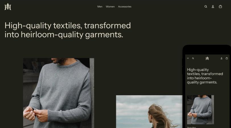
Heritage has an old-world feel without feeling outdated. It’s simple, soft, and leans into tradition—great for shops selling handcrafted or timeless goods.
- What makes it different? The fonts, the spacing, the way it slows things down. It doesn’t rush the shopper. And that’s the point.
- Best suited for: Smaller catalogues—think curated, artisan, or heritage-based products
- Notable features:
- Quick and painless setup – You won’t need a developer just to get started. It’s minimal and easy to launch.
- Designed for storytelling – If you’ve got a brand with roots—handmade, vintage, or small-batch—this layout feels right at home.
- Carts that convert – Sticky cart, slide-out cart, and quick buy are included to help shoppers glide through checkout.
- Good content support – From blogs and FAQs to promo banners and press mentions, you can share your story without cramming it into one page.
- Strong product pages – Videos, colour swatches, ingredient info, zoom, and high-res images are all built in—nothing feels missing.
- Smooth navigation – Features like infinite scroll, sticky header, and mega menu.
- Localized + flexible – Comes with EU translations, custom contact forms, and cross-sell blocks so you can scale when the time’s right.
5. Ritual – For Wellness, Skincare & Supplement Brands
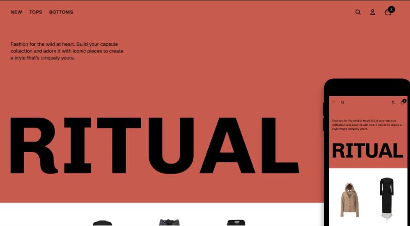
Ritual gives off that calm, “everything’s under control” energy. It’s minimal without being cold—perfect for wellness brands that need space to educate and build trust.
- What sets it apart? The layout feels light. There’s plenty of room for copy, icons, and product info, without overwhelming the shopper.
- Best for: Medium-sized catalogues in wellness, beauty, or health
- Key features:
- Fast to launch – Honestly, the setup’s pretty painless. You don’t have to dig around to make it look good—most of it just works out of the box.
- Calm, clean vibe – It’s built for wellness brands. The layout feels soft, intentional, and not salesy, which is refreshing.
- Cart features are baked in – You’ve got the usual stuff: sticky cart, quick buy, pre-order, slide-out cart. No weird apps needed.
- Solid content blocks – There’s room for blogs, FAQs, and even press mentions. Handy if your product needs a bit of explaining.
- Details are well-covered – Ingredient info, product videos, size guides, swatches… It’s all there without having to hunt for it.
- Easy to move around – Shoppers won’t get lost. Mega menu, infinite scroll, sticky header—makes browsing smoother, especially on phones.
6. Tinker – For Kids’ Brands, Toys & Creative Products
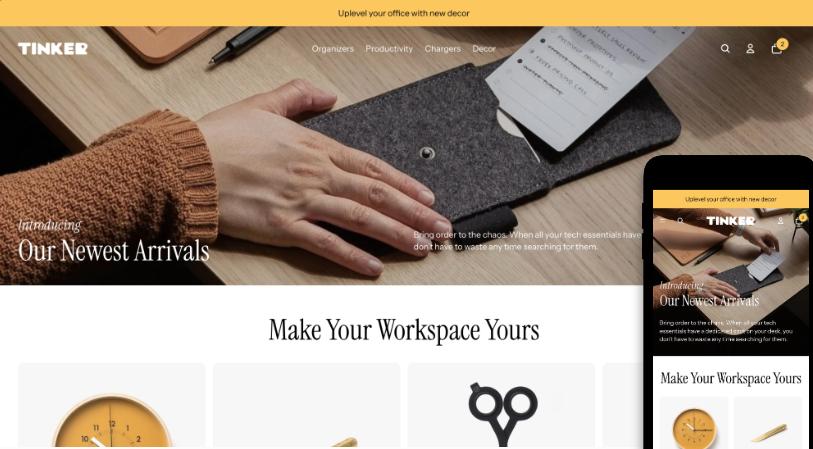
Tinker doesn’t take itself too seriously—and that’s its charm. The colours are fun, the layout feels friendly, and it’s made for products that spark joy (or chaos).
- What makes it stand out? There’s energy in the design, and it never feels messy. It works well for colourful, kid-friendly brands that still want a clean look.
- Best for: Small catalogues with playful or creative products
- Key features:
- Set up without stress
- Playful and friendly design – The layout feels cheerful without being loud. It’s ideal for brands aimed at kids or creative products.
- Cart tools are all included – You’ve got sticky cart, slide-out cart, pre-order, and quick buy—good to go, no apps required.
- Marketing stuff is ready – Banners, countdown timers, cross-sells, and even stock counters are built in to support sales.
- Visual product support – Swatches, image zoom, videos, ingredient info, and size charts help people see what they’re buying.
- Navigation feels easy – Includes mega menu, filters, sticky header, and infinite scroll so shoppers can move around without thinking twice.
- Nice extras for storytelling – Things like image galleries, lookbooks, press sections, and content blocks help give your brand a little personality.
7. Pitch – Perfect For Startups & Single-Product Brands

Pitch is sharp and to the point. If you’ve got one product—or a handful—you want people to land, scroll, and buy without distractions.
- What makes it unique? Instead of looking like a regular online store, Pitch works more like a landing page
- Great Fit for: Businesses selling a single product (or a very small collection) where every detail matters.
- Key features:
- Quick to launch – It’s lightweight and easy to set up. If you need to get your site live fast, Pitch won’t slow you down.
- Feels like a landing page – Bold hero section, focused CTA spots, and just enough content to tell your story without overloading.
- Checkout flow is streamlined – Includes slide-out cart, sticky header, quick buy, and “sign in with Shop”—everything’s built for speed.
- Marketing tools are already there – You’ve got promo banners, in-menu promos, stock counters, and recently viewed—all ready to flip on.
- Product pages get right to the point – Supports videos, image zoom, colour swatches, and delivery info, which keeps things clear.
- Mobile-friendly and snappy – Infinite scroll, swatch filters, sticky nav—browsing feels fast, especially on mobile.
- Perfect for focused brands – If you’ve got one product or a super tight catalog, Pitch keeps things tidy and conversion-focused.
8. Dwell – For Home Goods & Interior Brands

Dwell is all about space, visually and emotionally. It gives your products room to breathe, which works especially well for furniture, decor, or anything design-driven.
- What stands out? The layout is slow in a good way. It feels curated, not crowded.
- Best for: Medium-sized catalogues with a focus on visual presentation
- Features worth noting:
- Quick to launch – You won’t get stuck in setup. It’s pretty straightforward.
- Spacious layout – Everything feels open. Good if your products are visual—like furniture, decor, or anything that needs space to shine.
- Checkout tools included – Slide-out cart, quick buy, sticky cart—all the usual stuff’s already built in.
- Marketing features are baked in – Stock counters, banners, cross-sells, even “recently viewed.” It’s all there without extra apps.
- Product pages cover the essentials – Swatches, size charts, zoom, delivery info, video—it’s handled.
- Easy to browse – Sticky headers, filters, infinite scroll… nothing fancy, just stuff that works.
- Good for slower-burn brands – If you’re telling a story or selling something people take time to think about, this layout gives you room to do that.
9. Vessel – For Artisanal & Boutique Brands
Vessel spotlights on products. It’s quiet, clean, and feels more like a gallery than a storefront.
- What makes it unique? It doesn’t fight for attention—your photos do the work. Great if visuals are your strongest asset.
- Best for: Small product lines with strong imagery—ceramics, art, handcrafted items
- Notable features:
- Quick to launch – You won’t be stuck in theme settings all day. It’s built to help you go live without hassle.
- Gallery-style layout – Super visual. Perfect if your products look great and don’t need a ton of explanation.
- Cart tools already there – Slide-out cart, quick buy, sticky cart, and Shop login—make checkout smooth.
- Marketing tools? Covered. – You’ve got cross-sells, promo banners, stock counters, and even press sections if you need them.
- Visuals come first – Zoom, colour swatches, image rollover, videos, and high-res galleries help your products shine.
- Browsing feels fluid – Infinite scroll, sticky header, filters, mega menu—makes it easy for people to move around without thinking.
- Works best for focused catalogues – Ideal if you’re selling a handful of products and want them to take center stage.
10. Atelier – For Creators, Portfolios & Personal Brands

This theme doesn’t just look like a store—it feels like your space. If your brand is built on your story, your work, and how you do what you do, Atelier helps you bring that to life.
- What makes it unique? The layout blends ecommerce with portfolio-style content. It’s built for trust, not just transactions.
- Best for: Small catalogues, service-based brands, creators, or consultants
- Key features:
- Easy to launch – It’s light and quick to set up. You won’t need a developer to make it look polished.
- Great for content-first brands – The layout gives you space for storytelling—perfect for creators, artists, or service-based businesses that also sell.
- Checkout tools built in – Comes with slide-out cart, quick buy, sticky cart, and even gift wrapping if you’re shipping special orders.
- Marketing tools that don’t get in the way – Includes press sections, FAQs, blogs, cross-sells, promo banners, and more—without crowding your pages.
- Visual tools where they matter – High-res galleries, videos, ingredient or product info, image zoom, and swatches—if you’re showing off details, it delivers.
- Smooth, intuitive browsing – Sticky headers, mega menu, infinite scroll, and filtering make it easy to move through your store—even with a small catalogue.
- Feels personal, not corporate – If you’re building a brand around you (or your work), this one feels more “portfolio” than “template.”
How to Choose the Right Free Shopify Theme for Your Store
With ten solid free Shopify themes on the table, it’s easy to get stuck.
So, how do you pick?
It mostly comes down to three things: What you sell, how much of it you sell, and how you want people to feel when they land on your site
Step 1: What Are You Selling?
| Selling this? | Start here |
| Apparel, lifestyle, accessories | Fabric, Atelier |
| Food, snacks, coffee, drinks | Savor, Ritual |
| Furniture, home decor, and design items | Dwell, Horizon |
| One product or a small collection | Pitch, Vessel |
| Toys or anything playful | Tinker |
| Handcrafted or vintage goods | Heritage, Vessel |
| Creative work or personal brand | Atelier, Pitch |
This isn’t a hard rule, but it narrows the field fast.
Step 2: How Big Is Your Catalogue?
- Small (1–20 products) → Pitch, Tinker, Heritage, Vessel, Atelier
- Medium (20–100 products) → Ritual, Savor, Horizon, Dwell
- Large (100+ products) → Fabric, Horizon, Dwell
If your catalogue’s tiny, don’t overcomplicate things. Go lightweight.
Big catalogue? You’ll want room for filtering, collections, and faster browsing.
Step 3: What Experience Do You Want to Create?
- Do I need space for product education? → Ritual, Savor, Atelier
- Is visual storytelling a priority? → Fabric, Vessel, Heritage
- Do I want shoppers to take action fast? → Pitch, Horizon
- Is trust a big factor in my niche? → Ritual or Heritage
The beauty of these latest free Shopify themes is that they’re all built with a modern UX foundation, so you’re not starting from zero.
One Last Thought
Don’t get stuck chasing the perfect theme.
Go with one that covers most of what you need right now. You can tweak things later—or switch to something more advanced once you know what’s working for your customers.
The brands that win? They don’t wait. They get online, test the waters, and make it better over time.
Horizon Themes vs the Old Free Shopify Themes
Most of Shopify’s old free themes got the job done… but just barely.
They weren’t awful. They were clean, lightweight, and safe. But the design flexibility? Not great. And mobile experience? Felt like an afterthought.
The new Horizon Collection flips that.
What’s Changed
Here’s how the new free themes compare to the ones you might’ve used before:
| Area | Old Themes (e.g. Debut, Simple) | New Horizon Themes (2025) |
| Layout flexibility | Very limited | Drag-and-drop everything on every page |
| Design quality | Basic, borderline bland | Modern, mobile-optimized, brandable |
| Speed + performance | Meh | Faster, cleaner code, smoother browsing |
| Mobile UX | Functional, but clunky | Built for mobile-first shoppers |
| Catalog support | Meant for small shops only | Works well even with 50–100+ products |
| Theme sections | Just the homepage | Full page control with Shopify 2.0 everywhere |
| Visual appeal | Feels like a default | Feels curated—even though it’s free |
Should You Still Use the Old Ones?
You can. But… why?
Unless you’re building a temporary store or testing something quickly, there’s not much reason to start with older templates now. They’re not broken—but they’re not built for how people shop today either.
What Makes Horizon Themes Worth It
Honestly? They feel like paid themes.
Fast to launch. Easy to style. No awkward workarounds.
And you don’t need an app just to tweak a product page.
So if you’re launching anything real, especially in 2025, start with something that won’t limit you in six months.
Why These Free Shopify Themes Change the Game
You don’t need to spend thousands to launch a store that looks professional and converts well.
These new free Shopify themes aren’t just prettier—they’re built smarter. Faster load times, better mobile layouts, and more flexibility than the older free options ever had.
If you’ve been holding off on launching (or relaunching), this is your window. The tools are already there.
Your theme doesn’t need to be perfect. It just needs to help you sell, and these give you a real shot at that.
Need a Hand Picking or Customizing the Right Theme?
Sometimes all you need is a second opinion. Or someone to take what’s already there and make it feel like your brand.
That’s where we come in.
We help ecommerce founders:
- Pick the right Shopify website template based on what they’re selling
- Customize it without overcomplicating things
- Optimize for conversions, mobile flow, and long-term scale
📩 Get In Touch for a consultation
🎯 Or check out our Shopify Web Design Services