 647-812-5125
 Back to Ecommerce Glossary
What Is Mobile-First Design?
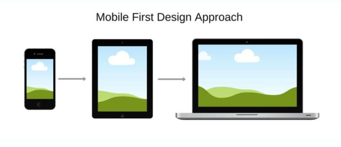
Mobile-first design is a design approach where a website is planned around phone screens first. Pages, content, and actions are decided with mobile in mind before anything is adapted for larger screens.
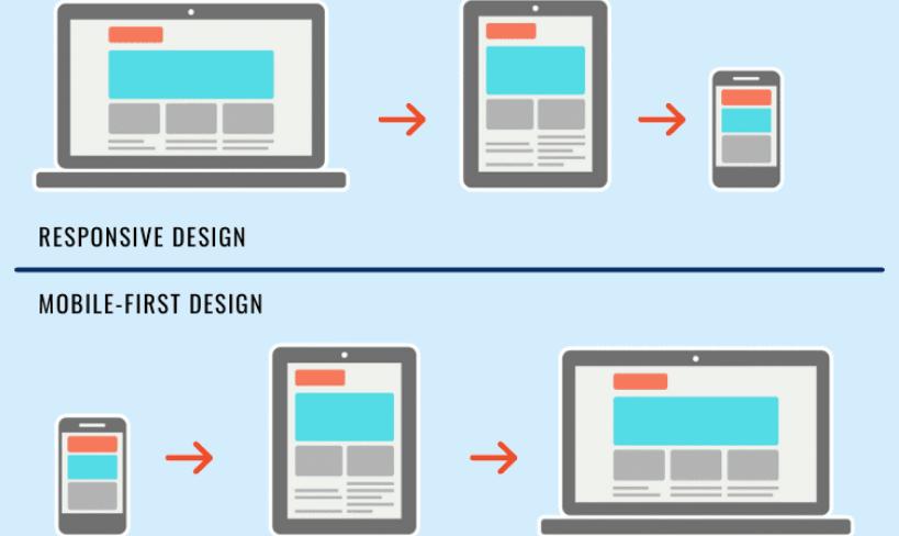
How Is Mobile-First Design Different From Responsive Design?
Both Mobile- First Design and Responsive Design approaches work across devices, but they are used differently. Mobile-first shapes decisions early. Responsive design adjusts what already exists.
Mobile-First Design vs Responsive Design |
||
|---|---|---|
|
Aspect |
Mobile-First Design |
Responsive Design |
|
Design starting point |
Planned for mobile screens first |
Planned as a single flexible layout |
|
Direction of design |
Built up for larger screens |
Adjusted across screen sizes |
|
Content decisions |
Priorities set early and what matters most is shown first |
Content is rearranged as per the device |
|
Layout intent |
Optimised for small screens |
Optimised for adaptability |
|
Interaction style |
Designed for touch use and small screens |
Designed for resizing layouts |
Why Mobile-First Design Matters in Ecommerce?
For most ecommerce stores, mobile is the first touchpoint and not desktop.
Mobile-first design matters because:
- Shoppers browse quickly and scan instead of reading
- Small UX issues feel bigger on phones
- Mobile users abandon faster when something feels unclear
- Checkout decisions often start on mobile, even if completed later
What Mobile-First Design Includes?
Mobile-first design focuses on clarity, hierarchy, interaction and what not to show.
It often means:
- Putting the most important information first
- Making main actions easy to reach with a thumb
- Keeping menus shallow
- Showing product details without endless scrolling
- Keeping pages light so they load quickly
- Reducing steps in forms and checkout
Mobile-first design decides what to remove, not just what to resize.
What Are Common Mobile-First Design Mistakes to Avoid?
Mobile-first design fails when mobile is treated as an afterthought.
- Desktop layouts squeezed into phones
- Using text that’s too small to read
- Hiding important actions like “Add to Cart” or key buttons
- Placing buttons too close together
- Ignoring how users scroll and tap with one hand
- Overloading pages with content
- Using large images that slow down page loading
- Not testing on real phones